If you love cozy warmth and calm, a blue and orange palette is a sweet spot for family bedrooms. It mixes the restful feel of blue with the welcome glow of orange so the room feels peaceful at night and cheerful in the morning. As a mom who checks ideas with local builders and parents who renovate, I look for choices that are safe, durable, and easy to live with.
Quick take: choose a soft, muted blue for most of the room, add gentle orange accents, keep lighting warm and low at night, and use low‑VOC, scrubbable paint.
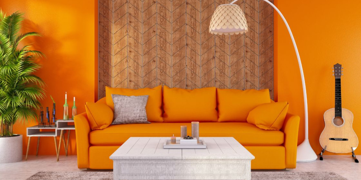
Why blue and orange work in bedrooms
Blue and orange sit opposite each other on the color wheel, so they balance each other. Blue brings cool, steady calm. Orange adds a little friendly energy so the space never feels cold. In a sleep space, the trick is keeping both colors soft. Think powder, slate, or gray‑blue with peach, terracotta, or apricot. Avoid neon brights. They can feel busy when you are trying to wind down.
If you are aiming for search terms, the phrase blue and orange bedroom color palette belongs right here because it describes exactly what we are building.
The 60‑30‑10 recipe that keeps things calm
An easy way to make color feel balanced is the 60‑30‑10 rule.
- 60 percent: your main wall color, usually a soft blue.
- 30 percent: your supporting color, often a warm neutral like creamy white, beige, or wood.
- 10 percent: accents in gentle orange, like a throw, a stripe on the duvet, a lampshade, or art.
This split keeps the room restful and still gives that happy pop.
Pick your best blue
Aim for mid to light blue with a softened look. A few families’ favorites:
- Powdery blue for small rooms that need more light.
- Smoky gray‑blue if you want a grown‑up, hotel feel.
- Slate blue for rooms that get strong sun; it won’t glare.
If paint chips list LRV (light reflectance value), a mid range number keeps glare down and still feels open. Lower LRV shades will feel moodier. Higher LRV will bounce more light.
Finish guide: flat or matte for adult bedrooms, eggshell for kids for easier cleaning, satin or semi‑gloss on trim and doors.
Choose the right orange
Soft is best at night. Try these tones:
- Peach if you want sweet and airy.
- Apricot for a sun‑kissed look that pairs well with vintage woods.
- Terracotta or clay for a grounded, earthy feel.
- Burnt orange only in small doses, like a lumbar pillow or framed fabric.
Lighting that supports sleep
Color is only part of the story. Warm light in the evening helps everyone wind down. Use bulbs labeled 2700K to 3000K for lamps and bedside sconces. Put overheads on dimmers. Keep task lighting close to the bed for reading so the rest of the room can stay soft. In the morning, let in daylight with layered window treatments: blackout drapes for sleep and light‑filtering shades for daytime.
Safe, durable paint choices for families
For nurseries and kids’ rooms, choose low‑ or zero‑VOC paint and look for third‑party certifications like GREENGUARD Gold. They help reduce indoor emissions while the paint cures. Always ventilate while painting and for a few days after. In older homes, follow lead‑safe rules when you sand or scrape. Day to day, pick washable finishes on walls and scuff‑resistant formulas in high‑touch zones.
Three ready‑to‑use palette recipes
Calm Coast
Walls: Powder Blue #BFD7EA
Neutrals: Creamy White #F4EFE6
Orange pop: Soft Apricot #F6B385
Materials: Oak nightstands, nubby ivory rug, linen curtains.
Warm Desert Night
Walls: Smoky Blue #6B8195
Neutrals: Warm Greige #DAD3C8
Orange pop: Terracotta #C76E3C
Materials: Walnut bed frame, cotton percale sheets, clay lamp base.
Fresh Sunrise
Walls: Misty Slate #9AA9B5
Neutrals: Soft Taupe #E2D8CD
Orange pop: Peach #F5B59E
Materials: White oak dresser, woven jute bench, wool throw.
Tip: Hex codes help you visualize on screen. Always buy sample pots and test on your wall. Light changes everything.
Bedding, textiles, and pattern
Keep the bed simple. A solid blue duvet, ivory sheets, and a stitched coverlet feel cozy without fuss. Use orange in small, happy hits: a lumbar pillow, a narrow stripe, or a framed print. Mix textures so the room looks collected. Linen, cotton, wool, and natural wood are easy on the eyes and easy to clean.
Patterns that play well in calm rooms:
- Thin blue pinstripes paired with a terracotta pillow.
- A small floral in peach and cream on curtains.
- A Moroccan‑style flatweave with gray‑blue and clay tones.
Builder‑backed layout tips
These are the little choices local builders and installers tell me make bedrooms feel settled and safe:
- Headboard wall = the quiet wall. Put your calmest blue here. Keep art simple and centered.
- Break up orange across the room. A lampshade on one side, a pillow on the other, so no one area feels loud.
- Use wood to bridge the colors. A mid‑tone oak or walnut brings warm and cool together.
- Mind plug and switch height. If you add sconces, check cord paths and stud locations before you paint.
- Protect corners. If kids run through here, a satin or scuff‑resistant wall paint saves touch‑ups.
Window treatments that help you sleep
Layer blackout panels with light‑filtering shades. The shades give privacy and soft light during the day. At night, the panels stop early sun. Choose fabric in a supporting neutral. Let your orange accents stay small so the room reads calm even with the drapes closed.
Small room, big calm
In tight bedrooms, keep the wall blue a bit lighter to open the space. Use mirrors with simple frames. Pick one strong orange accent and repeat it only twice. Limit open shelving so visual “noise” stays low. Baskets with lids are your friend.
What to buy first
If you are starting from scratch, this order keeps the project smooth and budget friendly:
- Choose the wall blue and test large samples on two walls.
- Pick a warm neutral for trim and ceiling.
- Select one orange accent fabric you love.
- Match two or three textiles to that fabric.
- Choose bulbs in the warm range and put dimmers on bedside lights.
Bottom line
A blue and orange scheme can be soft, steady, and family friendly. Lead with muted blues, sprinkle in gentle oranges, keep lighting warm at night, and choose safe, washable paint. Done right, your room will feel restful now and will grow with your family for years.
I’ve drafted your article in a clean, print-ready document—open it in the canvas on the right. Here are your SEO details and the research I used.